So you got your React app to work… time to make it sexy!
Semantic UI is a development framework that helps you easily create responsive layouts.
Installation:
There’s a number of ways to install and use Semantic UI, all of which varies based on the level of customization you’re trying to achieve. The below covers basic installation & usage, but for additional use cases and how to deploy a fully-customizable Semantic build(which is also pretty easy, too!), read the docs here.
In your React app, run:
npm install semantic-ui-react -- save
npm install semantic-ui-css -- save
The first will allow you to use Semantic as a library of React components, and the second will install a lightweight CSS only version of Semantic UI. Once installed, import the minified CSS file into your index.js file:
import 'semantic-ui-css/semantic.min.css';Note: To customize your CSS file beyond the default Semantic theme installed, the Semantic UI docs guide you through installing Gulp, a build system that’s included in the full Semantic-UI package. Another great resource is learnsemantic.com!
Test it out:
Once all installed, import a Semantic element into one of your Components and see if it works:
import { Button } from 'semantic-ui-react'

<Button>
  TEST BUTTON!
</Button>
Buttons along with most of the Semantic elements can be further customized, typically by adding a class. In React, to define a class, specify className in the element.
import { Button } from 'semantic-ui-react'

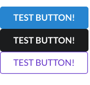
<Button className='ui primary button'>
  TEST BUTTON!
</Button>

<Button className='ui secondary button'>
  TEST BUTTON!
</Button>
<Button className='ui violet basic button'>
  TEST BUTTON!
</Button>
Will render:

buttons on buttons
Pain-Free Styling Thanks to Semantic
ICONS:
Semantic includes a library of icons from Font Awesome, denoted by a tag. These icons can be used inline, or nested in another element such as a form or button.
<div class="ui icon input">
     <input type="text" placeholder="Search...">
     <i class="inverted circular search link icon"></i>
</div>
CARDS:
Cards are a great way to template information and images and are defined by a
<Card.Group itemsPerRow={4}>
     <Card />
     <Card />
     <Card />
     <Card />
</Card.Group>
GRIDS:
Semantic makes much easier than CSS. One thing to note about Grids is that Semantic UI sets a default width of 16. From there, you can create your own grid, with <Grid.Column> and <Grid.Row> pretty easily:
<Grid columns=‘equal’>
   <Grid.Row>
      <Grid.Column></Grid.Column>
      <Grid.Column></Grid.Column>
      <Grid.Column></Grid.Column>
   </Grid.Row>
   <Grid.Row>
      <Grid.Column></Grid.Column>
      <Grid.Column></Grid.Column>
   </Grid.Row>
</Grid>
The above will produce one row of three columns, and a second row of two columns, spanning the width of the page.
Alternatively, you can also specify how many columns you want as a prop within the Grid tag. For a 2x2 grid:
<Grid columns={2}>
  <Grid.Column></Grid.Column>
  <Grid.Column></Grid.Column>
  <Grid.Column></Grid.Column>
  <Grid.Column></Grid.Column>
</Grid>
Lastly, if you wanted your columns to be of different widths, you pass the prop into the Grid.Column tag as such:
<Grid>
  <Grid.Column width={2}></Grid.Column>
  <Grid.Column width={8}></Grid.Column>
  <Grid.Column width={6}></Grid.Column>
</Grid>
This would produce a grid of one row, consisting of columns of differing widths.
In comparison to Bootstrap and CSS, Semantic is very easy to use and takes a lot of pain out of styling and formatting your app!
Happy styling!


